Sacred Funnels: Building Conversion Paths That Align With Buyer Intent
Most ecommerce funnels are built like mazes—full of popups, urgency tricks, and endless decision points. But what if instead of forcing conversions, we created funnels that felt intentional, aligned, and even sacred?
Welcome to the world of Sacred Funnels—a conversion strategy rooted in psychology, purpose, and buyer alignment, not pressure. In this model, your funnel isn’t a hard sell. It’s a journey: a clear, value-driven path that respects the customer’s energy and meets them where they are—emotionally, energetically, and spiritually.
Let’s explore what makes a funnel “sacred,” why it converts better, and how top ecommerce brands are designing soulful, strategy-rich journeys that lead to sales and trust.
🔮 What Is a Sacred Funnel?
A Sacred Funnel is a sales path that:
-
Honors buyer intent and emotional readiness
-
Uses symbolism, storytelling, and simplicity instead of pressure
-
Aligns brand energy with customer values
-
Treats conversion as a collaborative decision, not a trick
It’s part UX, part archetype, and all about creating a meaningful experience from click to checkout.
🧠 Why It Works: The Psychology of Buyer Alignment
According to Harvard Business School, 95% of purchase decisions are emotional—not logical. The Sacred Funnel approach embraces this truth by guiding buyers through a story that reflects:
-
Their current problem or desire
-
A shared set of values or intentions
-
A solution that feels personal, not generic
In other words, it sells without ever feeling like selling.
📊 The Data Behind Soulful Funnels
| Funnel Feature | Traditional Funnel | Sacred Funnel Benefit |
|---|---|---|
| Pop-ups on entry | 70–80% bounce rate | Sacred funnel uses delayed, intention-based engagement (35–50% bounce rate) |
| Generic landing page headline | 1–2% conversion | Purpose-based narrative headlines = 4–6% conversion (CopyHackers, 2023) |
| Confusing checkout flow | 60% cart abandonment | Value-aligned, minimal checkout = 20–35% lower abandonment |
| Retention after first purchase | ~20% | Brands with storytelling funnels retain 40–60% (Shopify, 2024) |
🌿 The 5 Stages of a Sacred Funnel (With Examples)
1. Attraction: The Totem Signal
Your funnel begins the moment someone sees your ad, search result, or link. Sacred funnels don’t shout. They signal—using imagery, values, and symbolism to attract the right buyer.
Example: A spiritual skincare brand uses moon phases and botanical imagery in their Facebook ad to draw in intuitive, ritual-focused buyers.
Trend: Ads that use intent-based copy (“For your skin’s full moon glow”) convert 30% better than product-first headlines (Source: Meta Ads, 2024).
2. Connection: The Landing Page with Meaning
Instead of a discount-first pitch, your landing page should mirror the customer’s deeper need and reflect your brand’s values.
Key elements:
-
A value-driven headline (“Rooted in nature. Designed for harmony.”)
-
A short brand story or mantra
-
Symbols or sacred motifs that match your archetype
-
Optional quiz or guide (for co-creation, not control)
Example: A jewelry brand presents three archetypes (The Muse, The Warrior, The Healer). Shoppers choose their totem to see products that resonate.
3. Nurture: Aligned Emails or Story Series
Rather than a 10% coupon and a barrage of promotions, Sacred Funnels use emails or follow-up flows to build resonance, not urgency.
Content ideas:
-
The meaning behind your materials
-
Customer rituals or testimonials as story
-
Symbolism behind products (e.g., “Why we craft with circles and serpents”)
-
A “buyer intention check-in” instead of a deadline
Example: After signing up, a customer receives a 3-part email journey:
-
“What your moon sign says about your self-care”
-
“Why we use obsidian: A protection stone legacy”
-
“Meet your match: Our energy-aligned rings”
4. Conversion: The Conscious Checkout
When the buyer’s ready, make the purchase feel ceremonial—not rushed.
What to do:
-
Simplify the checkout page (1–2 steps max)
-
Use affirmation copy: “You're investing in your peace”
-
Add symbolic elements (e.g., “Your item will ship on the next full moon”)
-
Show social proof based on values (“93% of customers say our blend helps them slow down”)
Example: A sustainable tea brand includes a short “Sip Intention” mantra on the checkout page and a box to write “your tea ritual” for a personalized label.
5. Expansion: Ritual Retention & Sacred Upsells
Post-purchase is where sacred funnels shine.
How to deepen the journey:
-
Send a flipbook or video explaining the meaning of the item
-
Offer a purpose-aligned upsell (“Add a moonstone spoon to elevate your tea ritual”)
-
Email sequences focused on care, integration, and storytelling
-
Invite buyers to share their totem or ritual (UGC with meaning)
Example: A crystal brand invites new buyers to a “Ritual of the Month” email circle that teaches how to use their stones with intention.
Result: 2x higher repeat purchase rate than brands with standard post-purchase flows.
🔮 Trends in Sacred Funnel Design (2025 and Beyond)
| Trend | Description |
|---|---|
| Ritual-Based Lead Magnets | Free downloads like “Your Style Archetype Quiz” or “Sacred Skincare Ritual” |
| Flipbook Funnels | Short motion-based storytelling sequences before the sale |
| Value Symbol CTAs | CTAs that reflect transformation (“Begin your ritual” > “Buy Now”) |
| Conscious Retargeting | Ads that reinforce intention, not urgency (“Still feeling drawn to this?”) |
| Energetic Timers | Seasonal/astrological alignment (“Ships before the Solstice”) instead of fake urgency |
🧘 Final Thought: Selling with Soul
The Sacred Funnel is not just a new tactic. It’s a paradigm shift—from pushing to aligning, from urgency to energy, from product-first to purpose-first.
When your ecommerce funnel respects the rhythm of the buyer—meets them in meaning—it doesn’t just convert.
It transforms.
So next time you map your funnel, ask yourself:
“Am I selling… or am I guiding a journey?”
Because when you lead with purpose,
the right buyers always arrive.
Ecom Totem Related Articles
From Product Page to Purpose: Designing Online Shops That Resonate
In the age of AI-generated content, endless product options, and one-click checkouts, ecommerce is faster than ever—but that doesn’t mean it’s better.
Today’s customers don’t just want convenience. They want connection. They’re asking:
"Why should I buy this—and why from you?"
That’s why the most successful online shops today are shifting from conversion-first design to purpose-driven experience. From product page layout to post-purchase flows, brands are now building digital storefronts that resonate with emotion, identity, and meaning—not just urgency.
Let’s explore how you can turn your online shop into a purposeful experience that builds loyalty, trust, and long-term success—and back it all up with real-world data and case studies.
🧭 Why Purpose Matters More Than Ever
According to Zeno Group’s Strength of Purpose study:
-
Brands seen as “having a strong purpose” grew 2x faster than competitors.
-
94% of global consumers say it's important that the companies they support have a strong purpose.
-
4 in 5 consumers say they would switch to a brand that aligns with their values.
In ecommerce, where attention spans are short and competition is high, clarity of purpose becomes a key differentiator—especially on your product pages, home page, and about sections.
🧠 The Psychology of Purpose-Driven Design
Purpose builds emotional trust, which leads to:
-
Increased conversion (emotion drives impulse)
-
Higher retention (people re-buy from brands they believe in)
-
Brand evangelism (shoppers become storytellers)
Designing for resonance isn’t just a branding move—it’s a conversion strategy.
📊 What the Numbers Say
| Metric | Without Purpose | With Purpose-Driven Design |
|---|---|---|
| Average Conversion Rate (Shopify stores) | 1.8% | 3–4.5% with brand-aligned pages |
| Customer Retention | ~28% | 40–60% with mission-focused UX |
| Bounce Rate (Home or Product Page) | 60–75% | 40–50% with storytelling + clarity |
| Average Order Value (AOV) | $68 | $95+ when product is tied to impact or story |
(Source: Shopify Benchmarks 2024, Klaviyo data reports, Nielsen Norman UX research)
🛍️ Case Studies: Brands That Resonate
🧼 1. Blueland – Purpose: Plastic-Free Living
Blueland sells refillable cleaning products—but their site design communicates far more. Their product pages break down environmental impact, carbon savings, and refill rituals.
Design elements:
-
Icons for sustainability stats
-
Clear “Why Refill?” section above the fold
-
Consistent eco-tone across visuals and copy
Result:
Reduced bounce rate by 37% after redesigning with purpose-first hierarchy.
💎 2. Mejuri – Purpose: Everyday Empowerment
Instead of framing jewelry as luxury, Mejuri markets it as a ritual of self-worth. Their product pages include emotional triggers like “Buy it for yourself,” paired with minimal, soft-toned visuals.
Design elements:
-
Storytelling in each product description
-
Subtle totemic symbols (moons, circles, eyes)
-
Flip-through visuals of real women wearing pieces at work or at home
Result:
Doubled self-gifting conversions and drastically increased retention among Gen Z buyers.
🌿 3. Allbirds – Purpose: Comfort Meets Climate
Allbirds doesn't just sell shoes. They show carbon footprint per product, emphasize sustainability in font and layout choices, and walk you through their regenerative materials.
Design elements:
-
Animated scrolls that teach while you browse
-
Icons that simplify sustainability stats
-
Messaging that ties comfort with ethical impact
Result:
AOV increased by 22% after adding purpose cues directly to product pages.
🎨 How to Design a Shop That Resonates
1. Start With Purpose, Not Products
Clearly state your “why” on the homepage, about page, and even in product descriptions.
Instead of: “Soft bamboo T-shirt”
Try: “The only shirt you’ll wear that saves water and recharges soil.”
2. Use Visual Symbols That Reflect Your Mission
Incorporate subtle design cues:
-
Circles for unity or cycles
-
Trees/leaves for sustainability
-
Geometric lines for structure, transformation
-
Feathers/moons for personal growth or ritual
These aren’t decorations—they’re subconscious signals.
3. Add Purpose to Product Pages
Include:
-
A section on impact (eco, social, or emotional)
-
Origin stories (Why was this product created?)
-
Values badges (Ethical, Cruelty-Free, Community-Backed)
-
Lifestyle flipbooks or motion visuals to show context
4. Minimize Clutter, Maximize Clarity
Too much noise kills emotional resonance. Keep:
-
1 clear CTA per page
-
A simple nav bar with 3–5 links
-
Consistent fonts, colors, and tone
Purposeful design is focused design.
🔮 Emerging Trends in Purpose-Driven Ecommerce Design
| Trend | Description |
|---|---|
| Totemic UX | Using sacred symbols and storytelling to evoke emotion and identity |
| Flipbook Lookbooks | Motion sequences showing story, usage, and emotion behind each product |
| Cause-Centered Navigation | Menu tabs like “Shop by Impact” or “Made to Give Back” |
| Mission-Based Bundles | Curated product sets based on value themes (e.g., “Mindful Mornings Kit”) |
| Transparent Footers | Adding sustainability metrics or community impact to the bottom of pages |
💬 Final Thought: Don’t Just Build a Store—Build a Movement
When you lead with purpose, your online shop becomes more than a place to buy. It becomes a mirror of your values, a home for your community, and a totem for transformation.
Your customers aren’t just clicking to buy. They’re asking:
“Does this brand stand for something I care about?”
If your store answers that with clarity, emotion, and intention—you won’t just get a sale. You’ll earn a follower for life.
Ecom Totem Related Articles
Ecommerce Minimalism: Streamline Your Store for More Sales and Less Stress
In the fast-paced world of ecommerce, it’s easy to believe that more = better. More apps, more product options, more pop-ups, more discounts. But as customers face decision fatigue and merchants drown in complexity, a new model is proving to be both smarter and more sustainable: ecommerce minimalism.
At its core, ecommerce minimalism is about simplifying your online store—not just for aesthetics, but for better user experience, higher conversions, and lower stress. Whether you're running a boutique Shopify store or scaling a multi-product brand, streamlining your store could be your best growth strategy.
Let’s explore what ecommerce minimalism really means, why it works, and how brands are using it to drive more sales with less clutter.
🌿 What Is Ecommerce Minimalism?
Ecommerce minimalism is a design and operational philosophy that emphasizes:
-
Clarity over clutter
-
Intentionality over impulse
-
Quality over quantity
It's not just about having fewer products—it's about creating a focused, frictionless path to purchase. Every button, product, and message serves a purpose.
📈 Why Minimalism Converts: The Data
-
According to Google’s UX research, users form an opinion of a website in 0.05 seconds—and visually complex websites are rated as less beautiful and less trustworthy.
-
Baymard Institute found that simplifying product pages (by removing visual noise and limiting CTAs) increased conversion by up to 32%.
-
Stores with fewer product options can see higher AOV and lower bounce rates, thanks to reduced choice paralysis (as proven in the well-known Jam Study by Columbia University).
In short: simplicity builds trust—and trust converts.
📦 Case Studies: Brands Winning With Minimalism
1. Everlane – Radical Transparency Meets Clean UX
Approach: Everlane’s site features wide white space, clean product grids, and a limited number of collections. Their menus are lean, and each product page emphasizes material quality and social impact.
Results:
-
Higher average session time
-
Conversion rate estimated 25–35% above fashion industry average
-
Clear trust signals = lower cart abandonment
2. Cuyana – “Fewer, Better” Philosophy in Action
Approach: This women’s apparel brand uses a capsule model with limited seasonal SKUs. Navigation is intuitive, and every element supports their mantra: “Fewer, better things.”
Results:
-
Loyal customer base built on intentionality
-
Higher repeat purchase rates from a minimalist audience
-
Their best-selling items often have just 3–5 color variants, not 30+
3. HiBAR – Plastic-Free Beauty with Minimal Clutter
Approach: HiBAR, a zero-waste shampoo brand, uses minimalist branding and a product-first homepage. They feature only a few SKUs and educate customers with iconography rather than text-heavy pages.
Results:
-
High retention among eco-conscious buyers
-
Fast-loading, mobile-optimized store layout
-
3x engagement on product pages with fewer distractions
🛒 Key Elements of a Minimalist Ecommerce Store
| Element | What It Looks Like |
|---|---|
| Simple Navigation | No more than 5 top-level menu items; focus on product categories, not clever jargon |
| Whitespace & Clean Design | Use spacing to guide attention; avoid unnecessary graphics or sliders |
| Focused Product Pages | One CTA, clear imagery, minimal color palette, short but persuasive copy |
| Limited Choices | Fewer products or variant options = faster decisions and lower return rates |
| Purposeful Popups | Use one or two (welcome or exit intent), not layers of overlapping messages |
| Mobile-First Optimization | Clean layout, large buttons, fast load speeds; minimalist designs thrive on mobile |
🔄 How to Streamline Your Store (Without Losing Your Voice)
1. Audit Your Product Catalog
Remove low-performing products or bundle them. Ask: Do we really need 12 versions of this product?
2. Simplify Your Homepage
Feature 1–2 bestsellers. Use visual storytelling instead of long text. Move secondary info to the footer or blog.
3. Trim Apps and Features
Too many apps = slow speeds. Use only essential tools: email capture, review integration, and checkout optimization.
4. Rethink Your Checkout Flow
Reduce clicks. Avoid surprise shipping fees. Offer express checkout (Shopify Pay, Apple Pay).
5. Invest in Brand Storytelling Instead of More Stuff
If your store tells a strong story, you don’t need to distract customers with options—your brand becomes the reason to buy.
🔮 Trend Forecast: Minimalist Ecommerce Is Only Growing
-
“Intentional shopping” is on the rise: 63% of consumers say they “only want to buy what feels essential or aligned with values.” (Accenture, 2024)
-
Shopify themes featuring minimalist designs are outperforming standard templates in speed and engagement.
-
Micro-capsule product drops are replacing traditional big collection launches for many boutique brands.
Minimalism isn’t a phase—it’s becoming the foundation of meaningful ecommerce.
🧘 Final Thought: More Sales, Less Stress
A minimalist ecommerce store doesn’t just improve UX—it improves your workflow, your customer’s clarity, and your long-term brand resonance.
When your store is clean, intentional, and value-focused:
-
Customers make faster decisions
-
You reduce overwhelm (for you and them)
-
Every sale feels aligned—not forced
So instead of asking “What can I add?”, start asking:
“What can I remove to let my message breathe?”
“What story does this collection really need to tell?”
Because when your store becomes a totem of clarity, customers don’t just browse—they buy with confidence.
Ecom Totem Related Articles
- The Psychology of Purchase: What Symbolism Teaches Us About Converting Customers
- Cart Abandonment Rituals: 7 Symbolic Touchpoints That Bring Customers Back
- Ecommerce Minimalism: Streamline Your Store for More Sales and Less Stress
- From Product Page to Purpose: Designing Online Shops That Resonate
- Sacred Funnels: Building Conversion Paths That Align With Buyer Intent
- Shopify with Soul: How to Build an Online Store That Reflects Your Mission
- The Totem Test: 5 Core Values Every Ecommerce Brand Should Represent
- Totem Brands: How to Build a Powerful Ecommerce Identity That Stands for Something
- Totemic Email Marketing: How to Turn Emails Into Story-Driven Sales Tools
- Visual Storytelling in Ecommerce: Using Icons, Symbols, and Motion for Deeper Brand Impact
The Psychology of Purchase: What Symbolism Teaches Us About Converting Customers
In today’s competitive ecommerce landscape, the brands that convert consistently aren’t just optimizing funnels—they’re tapping into human psychology. More specifically, they’re tapping into symbolism: the timeless language of emotion, meaning, and identity.
From the color of a logo to the shape of a pendant to the tone of a product description, symbols influence how we think, feel, and buy. In fact, many top-performing ecommerce brands use subconscious cues and archetypal imagery not as decoration—but as strategic conversion tools.
So what does psychology tell us about the role of symbolism in consumer behavior? And how can you use it to drive deeper trust, emotional resonance, and ultimately, more sales?
Let’s dive in.
🧠 The Psychology Behind Symbolic Buying
Symbolism works because it taps into deep-rooted mental shortcuts known as archetypes—universal symbols that evoke emotional responses across cultures and generations. These symbols bypass logic and speak directly to the limbic brain, the emotional center responsible for most buying decisions.
According to Harvard professor Gerald Zaltman, 95% of purchase decisions are made subconsciously—and symbolism is one of the most powerful tools for influencing that space.
🪶 Common Symbols That Influence Consumer Behavior
| Symbol | Meaning in the Mind | Use in Ecommerce |
|---|---|---|
| Circle | Unity, safety, inclusion | Logos, loyalty programs, bundles |
| Triangle | Strength, ambition, progress | Hero products, masculine design, energy motifs |
| Eye | Awareness, clarity, protection | Wellness, spirituality, transparency messaging |
| Feather | Freedom, ascension, softness | Fashion, home decor, feminine branding |
| Tree/Leaf | Growth, earth, trust, natural integrity | Eco-products, sustainability-focused brands |
| Moon phases | Intuition, change, cycles, emotion | Women’s health, self-care, ritual-based products |
| Gold | Value, success, spiritual abundance | Premium packaging, jewelry, luxury goods |
These symbols are not only aesthetic—they create instant, unspoken meaning that builds trust and connection.
📊 Symbolism & Conversion: The Numbers
-
60% of consumers say visual symbols help them “quickly understand what a brand stands for” (Adobe Creative Study, 2023)
-
Products that include symbolic visuals in packaging see an average 15–30% higher perceived value (NeuroDesign Journal)
-
Brands that align with emotional archetypes (e.g., "the healer", "the rebel") are twice as likely to command loyalty and charge premium pricing (Jungian Brand Survey, 2022)
In ecommerce, every product image, icon, and layout is a chance to trigger meaning. Smart brands use this to nudge buyers closer to a “yes.”
🔮 Case Studies: Symbolism in Conversion Strategy
1. Lush Cosmetics (Totem: Nature, Purity, Transparency)
Their entire aesthetic is built around natural symbolism—from hand-drawn illustrations of leaves and plants to unfiltered packaging and eco-core messaging. Even their store design and fonts feel organic.
Conversion result: Customers trust their ingredient transparency. Their website has a 3.4% conversion rate, higher than the beauty industry average (2.2%).
2. The Sill (Totem: Growth & Calm)
A plant delivery service that uses minimalist visuals, leaf symbols, and earthy colors to evoke care, patience, and inner peace.
Symbolic strategy: Their messaging aligns caring for plants with self-care.
Result: They’ve cultivated a devoted repeat-customer base, with email open rates above 35%—driven by emotional storytelling, not just sales.
3. Mejuri (Totem: Self-Worth & Ritual)
Jewelry isn’t sold as sparkle—it’s framed as a personal empowerment ritual. Their flipbook campaigns often show sacred shapes (eye motifs, moons, circles) and emotionally charged language ("wear your power").
Result: They dominate the self-gifting market, converting not just with product quality, but with identity alignment.
🛍️ How to Use Symbolism to Convert Customers
1. Identify Your Brand Totem or Archetype
What deeper emotion or transformation are you helping your customers achieve?
-
The Nurturer: Wellness, natural goods, eco products
-
The Warrior: Fitness, bold fashion, performance
-
The Mystic: Spirituality, mindfulness, symbolic wearables
-
The Creator: DIY, artistry, handmade culture
-
The Sage: Books, knowledge, guidance, rituals
Use this archetype to guide your entire customer journey—from homepage design to packaging.
2. Infuse Symbolism into Visuals
Use icons, layouts, and imagery that reflect your symbolic promise:
-
Circular “add to cart” buttons = safety and inclusion
-
Triangle product grid = strength and ascension
-
Moon-phase product slider = cycles and growth
-
Tree or eye icons in sustainability sections = trust and awareness
3. Make Symbolism Emotional, Not Literal
It’s not just about using an image—it’s about how it makes people feel.
Instead of saying:
“Our necklace has a moon on it.”
Say:
“This moon-shaped pendant represents the phases of your power—waxing and evolving with every choice you make.”
4. Use Flipbooks or Motion to Animate Meaning
Flipbooks and short animations allow you to literally bring symbols to life:
-
Show a tree growing as a product is revealed
-
Flip from day to night to showcase a moon cycle capsule collection
-
Transition a lotus from seed to bloom as part of a flip-through styling sequence
This visual storytelling reinforces symbolism in motion, creating emotional stickiness and higher retention.
🧭 Final Thought: Sell Meaning, Not Just Products
Conversion isn’t about pushing features—it’s about pulling hearts. And symbols are the bridge between your product and your customer’s inner world.
So the next time you're designing a homepage, writing a product description, or packaging a new collection, ask yourself:
What does this symbol mean? And what does it unlock in my customer?
Because the brands that convert are no longer the loudest—they’re the ones that resonate.
Ecom Totem Related Articles
- The Psychology of Purchase: What Symbolism Teaches Us About Converting Customers
- Cart Abandonment Rituals: 7 Symbolic Touchpoints That Bring Customers Back
- Ecommerce Minimalism: Streamline Your Store for More Sales and Less Stress
- From Product Page to Purpose: Designing Online Shops That Resonate
- Sacred Funnels: Building Conversion Paths That Align With Buyer Intent
- Shopify with Soul: How to Build an Online Store That Reflects Your Mission
- The Totem Test: 5 Core Values Every Ecommerce Brand Should Represent
- Totem Brands: How to Build a Powerful Ecommerce Identity That Stands for Something
- Totemic Email Marketing: How to Turn Emails Into Story-Driven Sales Tools
- Visual Storytelling in Ecommerce: Using Icons, Symbols, and Motion for Deeper Brand Impact
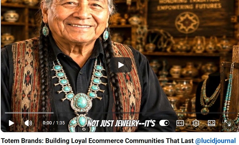
Totem Brands: How to Build a Powerful Ecommerce Identity That Stands for Something
In an ecommerce world saturated with endless choices and cookie-cutter stores, consumers are no longer just looking for products—they're searching for meaning.
Enter the Totem Brand: an ecommerce identity that doesn’t just sell things, but stands for something deeper—values, energy, symbolism, and connection. These brands don’t chase every trend. Instead, they build a foundation on what they believe, express it visually and emotionally, and turn customers into loyal followers, not just one-time buyers.
Let’s explore what makes a Totem Brand, how to build one, and why it’s the future of ecommerce success.
Click Here To Watch Video
🪶 What Is a Totem Brand?
A totem, historically, is a symbolic representation of a group, tribe, or belief system. In the ecommerce space, a Totem Brand is a business that embodies specific values or archetypes that customers emotionally align with. These brands:
-
Have iconic visuals or symbols that represent their mission
-
Tell stories with every product, email, or piece of content
-
Represent more than a niche—they become a belief system
-
Attract customers who feel part of something bigger than a transaction
Examples include brands rooted in sustainability, empowerment, spirituality, freedom, or minimalist living.
📊 The Rise of Symbolic & Values-Based Ecommerce
Modern consumers, especially Millennials and Gen Z, crave meaning in their purchases.
-
According to a 2023 Deloitte survey, 64% of Gen Z and 55% of Millennials say they “prefer brands that reflect their personal values.”
-
Harvard Business Review reported that emotionally connected customers have a 306% higher lifetime value than satisfied ones.
-
Shopify's Future of Commerce report states that brands with “strong visual identity and clear purpose” saw a 30–50% higher conversion rate in DTC spaces compared to generic competitors.
This means: if your brand carries a totemic identity, you build both emotional loyalty and market longevity.
🧿 Case Studies: Totem Brands in Action
1. PANGAIA (Totem: Regeneration & Earth Stewardship)
PANGAIA sells minimalistic clothing, but what they really sell is planet-conscious innovation. Each product is infused with purpose—like seaweed fiber or natural dye tech—and every garment includes a science-backed product story.
Why it works: Their symbolic identity (Earth as a sacred system) comes through in every label, email, and design.
2. MEJURI (Totem: Everyday Empowerment & Self-Gifting)
MEJURI doesn’t just sell jewelry—it redefines it as a ritual of self-worth. Their branding leans heavily on minimalist design with powerful archetypes: independence, femininity, ritual, luxury-with-purpose.
Why it works: Customers see MEJURI not as trend-based accessories but as personal totems.
3. TENTREE (Totem: Nature Loyalty & Responsibility)
For every product sold, TENTREE plants 10 trees. Their visual identity is rooted in nature symbols, earthy palettes, and sustainability pledges.
Why it works: The act of buying becomes a ritual of environmental contribution—deeply symbolic for their customers.
🔮 5 Traits of a Totem Ecommerce Brand
| Trait | Description | Example Application |
|---|---|---|
| Symbolic Core | Uses a symbol, archetype, or motif as a brand anchor | Tree icon, moon phase, minimalist triangle |
| Emotional Narrative | Each product or campaign ties to a bigger value or belief | “Wear your power,” “Crafted for your cycles” |
| Visual Consistency | Repeats sacred shapes, fonts, or color schemes to build recognition | Neutral tones, nature-inspired symbols |
| Customer Rituals | Encourages intentional, repeated actions (gifting, affirmations, planting, reflecting) | “Unbox your daily ritual” |
| Social Value Integration | Product serves a purpose beyond profit | Plant a tree, donate a portion, support a tribe |
🎨 Building Your Totem Brand: Step-by-Step
1. Define Your Totemic Archetype
What energy or value does your brand represent?
-
The Healer: Wellness, self-care, plant-based goods
-
The Warrior: Strength, resilience, bold apparel
-
The Sage: Wisdom, timeless design, sustainable ethics
-
The Creator: Artistry, transformation, DIY
Choose an archetype and build your brand identity around it.
2. Design with Symbolism
Use fonts, logos, colors, and packaging that represent your brand’s mission. Think:
-
Circle = unity, cycles
-
Triangle = strength, transformation
-
Eye = clarity, protection
-
Plant = growth, nature
Your brand visuals should feel intentional, not decorative.
3. Tell Totemic Stories
In your product descriptions, emails, social captions:
-
Speak to values and intention (“This piece channels confidence”)
-
Introduce sacred language (“Crafted with care, worn with purpose”)
-
Invite your audience into a belief system (“Join the ritual,” “Wear your mantra”)
4. Create Community Through Shared Symbolism
Let your customers feel like part of a tribe:
-
Branded hashtags based on totems (#Earthkeepers, #LunarMuses)
-
Encourage symbolic unboxings or rituals
-
Build collection drops around symbolic cycles (solstice, moon phases, seasons)
5. Use Flipbooks or Motion to Bring Totems to Life
Flipbooks and animations let you showcase your brand totems in living form:
-
Show a necklace with a snake transforming through animation
-
Let a moon cycle graphic evolve as part of a garment showcase
-
Create flip-through lookbooks that move like a ritual or reveal
📈 Totem Branding Performance Metrics
| Metric | Traditional Brand | Totem Brand Benchmark |
|---|---|---|
| Email open rate | ~15–18% | 25–35% (values-driven subject lines) |
| Customer retention | ~25% | 40–50% with symbolic loyalty programs |
| AOV (Average Order Value) | $50–75 | $80–120 when products are tied to intention or cause |
| Instagram save rate | ~5–8% | 15–20% when content is purpose-themed or symbolic |
🧭 Final Thought: Don’t Just Build a Store—Build a Totem
Your ecommerce brand is more than your product page, ad copy, or Instagram grid. It’s a symbol of what you stand for.
Totem brands don’t chase customers—they attract aligned followers.
So when you build your ecommerce identity, ask yourself:
“What do we protect?”
“What do we symbolize?”
“What tribe are we inviting in?”
Because when your brand becomes a totem, your customers don’t just wear it.
They believe in it.
Ecom Totem Related Articles